Wonder Woman is Going to Wear Pants After All!
Starting in June, Wonder Woman is getting a very conservative costume redesign. Not only will she get pants and sleeves, but she’s getting a pretty high collar as well. I am completely in favor of this change! The new costume is designed by current Wonder Woman artist David Finch.
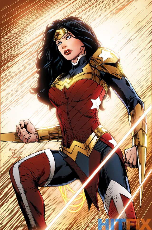
Pants and arm stabby thingies
It’s just a shame that I stopped reading Finch’s Wonder Woman…
I definitely like the new costume. And in today’s world, with the push for treating female supeheroes equally, there was no excuse to keep Wonder Woman in that one-piece bathing suit. It just didn’t work anymore. This new outfit is pretty cool. Maybe I’ll pick up an issue or two. It’s not as modern as what Spider-Woman got, but it’s still a nifty new outfit for Wonder Woman.
Oh, and apparently Superman is getting a haircut and Batman is becoming a robot. So there’s a lot going on at DC, it would seem!
——————
Posted on March 12, 2015, in Comics, DC and tagged Wonder Woman. Bookmark the permalink. 29 Comments.


The Finch run has been pretty bad so far, but this costume… man. How does such a great, conservative costume design come from David Finch, the man who inspired that image of other JL members imitating that one Wonder Woman pose? I’m definitely going to have to pick this issue up when it comes out, just so I can see how cool Wonder Woman looks. Too bad she’ll still probably be written terribly.
This oddly reminds me of the 90s “armored daredevil” costume.
It could be far, far worse, though: At least it’s nothing like Thor’s or Invisible Woman’s 90s redesigns. 🙂
Now is definitely the time for the 90s to be nostalgic.
I’m just going to leave this thing I agree with here:
http://www.theothermurdockpapers.com/2011/12/in-defense-of-armored-daredevil/
If only they’d gone ahead with their original pants plan in the New 52, then Azzarello’s Wonder Woman would have had the great costume.
I don’t love this design.
Is not bad but it just doesn’t do it for me.
I think is a combination of the shape of those shoulder pads, thigh high boots, that thing that looks like a loincloth and those stars, it reminds me of those toys with the armor that looks cool but never appeared in the original material.
Also I’m going to assume those things on her arms are retractable and she is not going to have them out all the time so I’m ok with them, otherwise you can add them to the previous list.
I’m ok with giving Wonder Woman a more conservative costume, but I think this looks too “crowded”, like they put too many details on it, I prefer when costumes keep it simple.
I think what I liked most about that new design is that besides pants she is also using a shirt under her armor, is a minor thing but it feels right.
Ha! You’re right! It definitely looks like Battle Armor Wonder Woman. It’s definitely too busy.
I can understand this, and I had similar thoughts about the shoulder pads and the boots. However, I’ve decided that I like how bulky the shoulder pads make her look; it gives her this appearance of added muscle definition, and I feel it gives her a more dramatic and powerful presence, especially when standing next to the likes of Superman and Batman. As for the thigh high boots… I don’t know. Yes, they’re a little awkward, but I feel like the costume might not have enough red in it if they weren’t thigh highs.
There are really only two things that bother me: the spiked bracelets, and the color scheme. Wonder Woman doesn’t need spikes; she has super strength. I want to see her punch people, not slice them up. Besides, if she has any weaponry, I prefer her just using her lasso, mostly because it’s so unique to her character and feels like a shame to ignore it in favor of more generic weaponry. And when it comes to the color scheme, I’m mainly upset that they went with blue instead of black. And the bracelets really should be silver.
Black clothe and silver bracelets would crash horribly with the rest of that outfit, not one to care much about fashion but still.
Also in a lot of comics WW uses swords for various reasons, as I said before I think they are retractable and she will only use them sporadically, like when she needs to cut something or is fighting a weapon user.
I actually think that’s black cloth, not blue. You can definitely see it as black if you blick that link to check out a shot of her standing next to Superman in her new duds. And I would have been happy with all silver instead of the gold. I liked the silver on her New 52 costume a whole lot.
WHOOPS. I meant I wanted for them to go with blue cloth instead of black. I really should read over my comments more carefully before posting them.
I find it meh. It’s kind of a bland design. I feel like Finch was told, “Give Wonder Woman a more conservative costume,” and he just half-assed it by covering her up completely. A good costume should say something about the character. This costume says nothing. It’s totally generic. Wonder Woman should wear something inspired by ancient Greece. Either something like Hoplite armour, or something robe-like.
Yeah, I can definitely see that. There isn’t really anything…unique or standout about it.
I am afraid I have to disagree with the costume. I gave it a blow-by-blow of everything that’s wrong with this design over at http://comicmusings.tumblr.com/post/113448338941/dcs-brave-new-direction-more-of-the-same
I would possibly be OK with a Wonder Woman mullet. I’d want to see it in action first, of course.
Be careful what you ask for, Henchie! Gar Logan still has not fully recovered from that mullet back in the 90s.
He got over being red easily enough.
Only after he had a Lobdell extraction surgery. Those things are always painful 😉
I would remove the shoulder pads, those spiked bracelets that make her look like Wolverine and that piece of cloth near her crotch that serves no purpose. Other than that, I actually like what Finch is going for here. With some alterations, this could be great. It’s a shame the stories aren’t great these days…
Hey now, crotch clothes have a very long and storied history in comics…I think.
Yeah, personally I don’t care for it. I’m all for being more conservative, but I thought Cliff Chiang did a fantastic job of that with the old costume. Dave Finch doesn’t need more conservative costumes, he needs female anatomy lessons. I do like that they’re going back to gold instead of silver.
Superman’s new costume is an improvement, though. Of course, anything is an improvement over what he’s wearing now. Hopefully they’ll get somebody decent to design whatever he’s wearing after that. If they let Aaron Kuder design it, I’d be really happy.
I’m glad DC is going in a new direction, but it’s hard not to notice how much of it seems to be just bringing back stuff from the old universe, to varying degrees. Not that I’m complaining.
As much as DC may have liked their New 52 initiative, they are at least smart enough to see that it wasn’t as big a success as they’d hoped. If they want to survive, they need to change with the marketplace and the audience, and if that means falling back on some more traditional stuff, then so be it. As long as they’re putting out good comics, I’ll keep reading.
And yeah, maybe this costume will look better when someone other than Finch is drawing…or the other Finch is writing.
I totally agree with this. Cliff Chiang’s Wonder Woman totally rocked the swimsuit look – she was a foot taller than everyone in the room and actually looked like a goddess. But that’s not how David Finch draws women. So I guess this redesign is kind of bittersweet
I also agree. Cliff Chiang drew Wonder Woman perfectly in every issue.
I agree, Chiang had the perfect look.
But apparently DC listened to all of the fanboys who hollered that Diana ‘looked like a man’- goodness forbid a woman have *muscle.*
Chiang’s build for Diana reminds me of the legendary strongwoman Katie Sandwina:
– http://cdn.loc.gov/service/pnp/ggbain/06800/06840v.jpg
– http://prints.encore-editions.com/0/500/katie-sandwina-the-lady-hercules-holding-up-three-men.jpg
– http://www.allexplore.com/5621ef190.gif (yes, that is an actual CANNON she is balancing on her chest)
– http://farm8.staticflickr.com/7132/7628685600_5d7644aa61.jpg
What’s remarkable of newspapers of the time is that nobody mentions that she looks ‘manly’, but rather everybody seems to be struck by her beauty, one reporter even writing that “beauty is strength, and strength is beauty.”
I wish DC had kept Chiang’s look for Diana. But goodness forbid a female hero not fit very narrow perceptions of wank-material.
Seriously? People were complaining that Chang’s Diana looked like a man? That’s utterly ridiculous! Chang’s Diana was amazing!
Oh, Henchie, that was the cry all over the boards. Guys complaining that Diana didn’t look hot enough and that she was too manly.
I wanted to moebius-slap them so hard.
That Batman robot thingie in the link looks Duuuuumb. LIke electrical power blue Superman dumb.
We shall see. For now, I applaud DC trying out new things.