Category Archives: Comics
Review: Punisher #8
Finally picking back up with the Punisher and the Bride facing off at the fireplace, the latest issue of The Punisher moves the plot forward in several ways. But it does so without fixing any of the frequent problems I’ve had with this series. Perhaps, like Teen Titans, I should just accept certain problems as part of the story and move on. Because if you overlook those issues, there really is a decent Punisher story here. And the twist ending is very exciting.
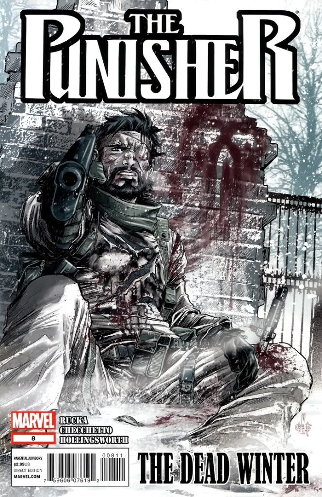
Punisher #8
We might finally get to see the Punisher doing some punishing next issue!
Comic rating: 4/5: Good.
The Punisher himself remains a quiet phantom, there’s no changing that. But at least we get appearances from all the other major players, we even learn a bit more about a lot of them. Not that this ‘bit more’ really adds anything, especially to the villains. As far as I’m concerned, The Exchange has fallen flat on their faces as bad guys. Adding a bit of tension between them means zilch at this point. But it’s better than nothing, I suppose. I enjoy plot progression at least.
But when is he going to lose that stupid eye patch? Did Punisher lose his eye or what?
Synopsis and spoilers after the jump!
Death and Return of Superman 4 Hire
Marking the 20th anniversary (almost) of the Death of Superman, “Chronicle” screenwriter Max Landis gives us this glowing tribute, featuring the talents of Elijah Wood and Mandy Moore. Enjoy! It’s perhaps the most accurate rendition I’ve ever seen.
Review: X-Factor #231
Only more questions arise in the latest chapter of Madrox’s ‘afterlife’ adventure. I want the conclusion already! This issue dips in quality because it devotes far too much time to a bunch of alternate reality characters that just don’t matter. Or maybe they’re going to matter in future stories? I rather hope not, because there was nothing very interesting about this reality. When Madrox isn’t the focus, the book issue is incredibly boring. But when Madrox has the time to shine, the book is a gem.

X-Factor #231
Clear answer: give us more Madrox!
Comic rating: 4/5: Good.
Basically this issue feels a bit like padding. The entire issue is spent with Madrox, but we don’t learn anything new about his predicament, don’t get any revelations about the ‘truth’ of his duplicating powers and we don’t get any closer to Madrox returning home. It’s basically just Madrox hanging out in an alternate reality, but rather than one filled with character like the one with the wedding, this reality feels mostly cliche. Not to mention the fact that it drops a lot of random references to ‘House of M’ and ‘Civil War’, plus features a character who hasn’t been seen in so long that new readers won’t have any clue why he is important.
But all this worry is only temporary, as next issue is the conclusion to ‘They Keep Killing Madrox’! I’m on pins and needles!
Synopsis and spoilers after the jump.
‘Before Watchmen ‘ Announced, Because Everybody Loves Prequels
I give you, Watchmen Babies!
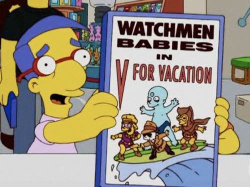
Everything's coming up Milhouse!
Well, sort of…but not quite. DC has finally officially announced Watchmen 2. Only they’re going to be prequels, under the banner of ‘Before Watchmen’. This is pretty cool news, and I wish I could give it a bigger push.
But this has been a pretty lousy week for my blog. Chalk it up to a busy day job. I may not be posting as much cool stuff, but you readers should know that I’m going to be earning a ton of overtime covering this big murder trial. So…yay me! I’ll try to get comic reviews up like normal this weekend, and a new list.
But for now, let’s check out this badass Watchmen announcement. Check out the titles and some covers after the jump.
Review: Teen Titans #5
Writer Scott Lobdell and artist Brett Booth team up to deliver what could be the very best issue so far of the new Teen Titans series. The problem is that I only say that because this issue is wall-to-wall action and fight scene, meaning there isn’t time to focus on the various problems I’ve had with this series. Still, great fight scene! The Titans take on Superboy in this issue, marking their first real superhero brawl as a team.
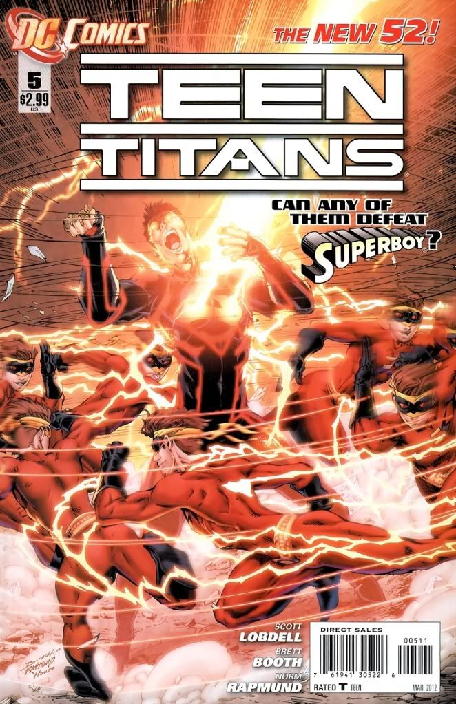
Teen Titans #5
Do they win? Well, you’ll just have to keep reading to find out.
Comic rating: 4/5: Good!
I’m going to try, from now on, to get over the various hang-ups I’ve had with this series. I can’t keep repeating them over and over again in every review. The dialogue feels forced, N.O.W.H.E.R.E. is a terrible villain and this team of Titans feels like they were picked out of a hat and just thrown together. These aren’t going to be fixed because one random guy is whining on the Internet. So I’m just going to start incorporating them into the basic fabric of the book. If they get better, I’ll let you know. They’re all still evident in this issue, but they don’t drag down what is an otherwise awesome fight scene.
Every character that appears in this issue gets their moment to shine, highlighting new aspects of their personalities while building towards a better story overall. Definitely an issue I would recommend.
Story and synopsis after the jump!

 Henchman-4-Hire